
“Banded” rows means to apply shaded color to alternate rows in a table or grid, usually to make it easier to read the data. This is a common Excel practice. And guess what? You can do this easily in Narrative Reporting Reports.
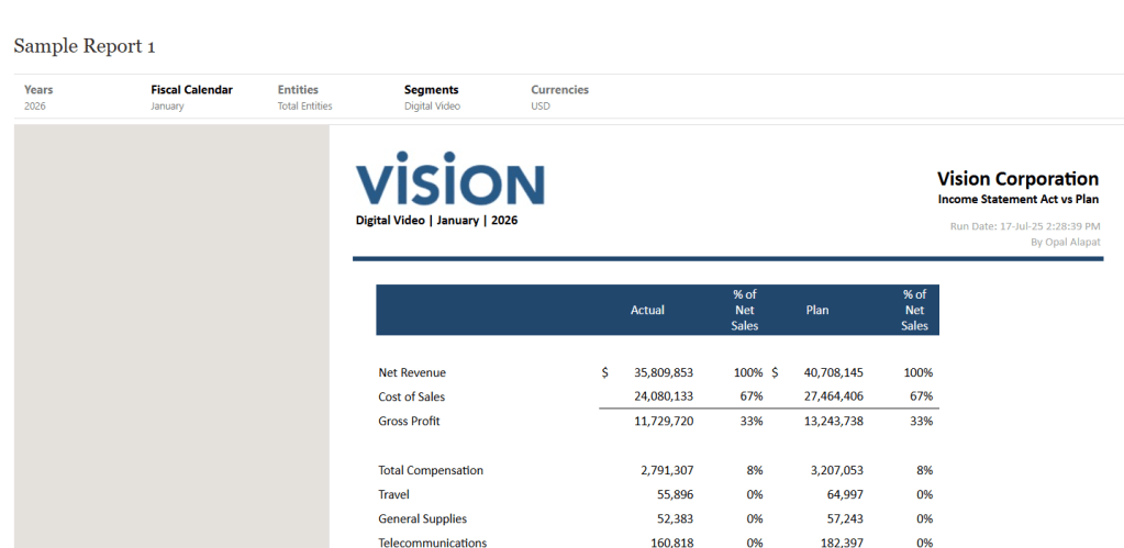
Here’s what a normal report looks like in Reports before you turn on row banding:
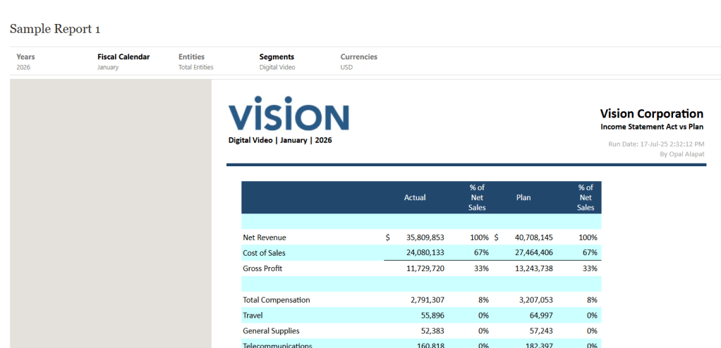
And here’s what it looks like after applying row banding:
It’s just a simple setting you have to turn on in Reports. It’s actually easier to configure in Reports than Excel. 🙂
There are some things to note about this feature before I show you how to configure it:
- You can only apply this to grids and grid rows (i.e. not other reporting objects and not columns).
- You can turn it on or off and then set a color. There are no other configuration options (like skip first row, etc.).
- You can pick whatever color you want for the row shading. If you don’t want one of the preconfigured colors and need a custom color, grab the hexcode for it and you can program that into this setting.
- Always keep in mind the color of your grid text and conditional formatting when you use this feature. You may have to change some things around if the banding color you select interferes with other formatting in your report.
Now let’s set it up. First, you will need a grid with at least 2 rows. This is to confirm that the setting works properly.
Second, you need to know what color to use for the row banding. If you need a specific color, use the hexcode. Don’t know what it is? Find a website that can use a picker tool to find the exact hexcode color you’re looking for from an image or another website.
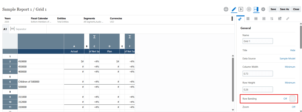
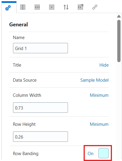
Once you have your grid and your color, go into the grid editor mode of your Report and find the General properties tab.
Under the General section, navigate until you find Row Banding. It will be set to Off by default, like shown below:
Click the Off toggle until it changes to On:
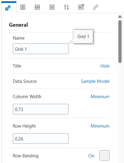
Next, set the color you’d like to use for your shaded rows. Click the shaded box to the right of the Row Banding On/Off toggle. You can select from a predefined list of colors or you can type into the top field the hexcode of the specific color you want:
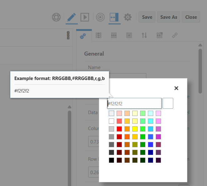
I’m going to use the pre-selected light blue color. If you select an already defined color, the color picker window will automatically close. If you type in a hexcode, press Enter to set that color, which will then close the color picker window.
Now my row banding configuration is complete. My setting is On and I have a color selected.
My report now looks like the example I showed at the beginning of this blog post.
As a final step, make sure you run the report a few times with different types of data to ensure the new banding color does not interfere with other formatting options of your report. Make tweaks as required.
Enjoy!
